
|
The Brode Report | August 2015
|
||||||||

I’m always happy to reconnect and catch up.
If you have Excel questions please call or email me the troublesome spreadsheet.
If obscure corporate finance questions come up I’m happy to help.
And I certainly expect a call if financial strategy questions arise!
I’m at (303) 444-3300 or dbrode@brodegroup.com
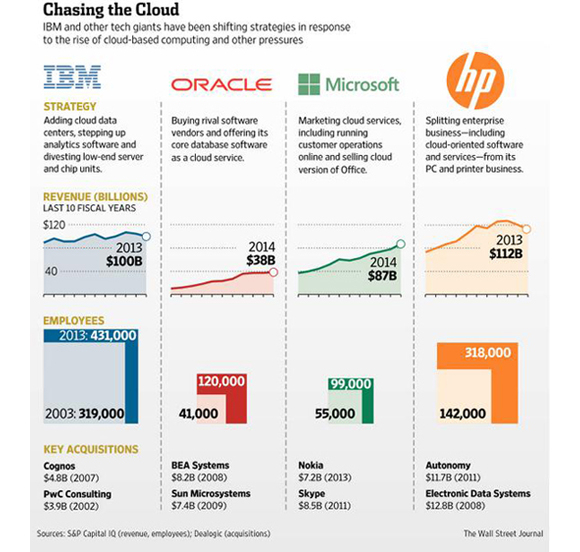
Bad Charts... and Insights From Better Ones I first met Charley Kyd in the late 1990s when we were both enamored with TM/1, the (still excellent) OLAP software tool now owned by IBM and known as Cognos TM1. Charley is definitely an Excel master and writes frequently about spreadsheet reporting technology and issues. Recently he released a piece called Bad Chart! Bad, Bad Chart! about a particularly poor graphic the Wall Street Journal published. The offending chart in full was this:
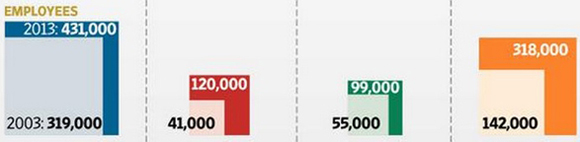
The bottom part of the chart is the egregious bit. Here it is, a bit larger:
Charley correctly nails the essence of the problem with this chart:
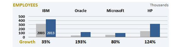
Charley then goes on to suggest this as an improved version of the chart:
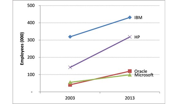
I certainly agree that this is far better than the WSJ’s original chart. Still, something was missing for me. Consider this chart:
If our goal is to transmit information to the reader’s brain, as Charley suggests, this transmits more information more quickly in my opinion. It says:
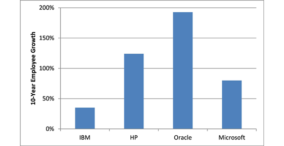
When I first looked at the chart I noticed that Oracle started below Microsoft and finished above it, so it must have a much higher growth rate. When I plotted out the growth rates in a single chart, I found this:
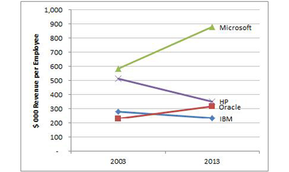
These previous charts have focused on employee counts and how those have changed over time. The original Wall Street Journal chart also noted the annual revenue of each company. It’s interesting that IBM, HP, and Microsoft are all within range of each other in revenue terms (around $100B/year now) and Oracle is much smaller. I did a little research and found the revenue back in 2003 as well. And if we have employees and revenue, then we’re just one operation away from one of my favorite metrics: revenue per headcount. Let’s graph that:
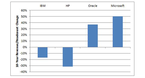
While we’re at it, I also graphed the change in revenue per headcount:
I’ve written about revenue per headcount before, back in March 2003 and December 2011. In the more recent newsletter of the two we looked at a histogram rev/HC in large organizations and concluded that it’s rare to see $1M rev/HC in a non-capital intensive business. I am extremely surprised to see Microsoft growing at a healthy rate while increasing revenue per headcount by 50%. Normally I expect growth vs. margin tradeoffs where you get more revenue albeit at a lower margin, and my speculation is that’s what has happened at HP and IBM since 2003. In the end, though, revenue per headcount is only one metric of many. Note that we have not touched on EBITDA margins or cash flow or the stock price or dividends, so we’re pretty far from having a comprehensive view of value drivers. Nonetheless, at least we teased some good learnings and further questions by starting with a truly horrible chart.
|
| |
Connect with me | | | Share your thoughts | | | Subscribe | | | See past issues | | | www.brodegroup.com |
| The Brode Group
|
Strategic Financial Consulting - Real-World
Results
|
(303) 444-3300 |